Why Government Websites Are Different
When a private business has a clunky website, a frustrated visitor leaves and shops elsewhere. When a government or municipal website is hard to use, a resident may miss a permit deadline, fail to register for a benefit, or simply give up on participating in civic life. The stakes are higher, and the audience is everyone — not a curated customer segment.
That distinction shapes every design decision a municipality should make.
Accessibility Is Not Optional — and It's Bigger Than Checkboxes
Federal law requires that government websites meet accessibility standards, most commonly referenced through the Web Content Accessibility Guidelines (WCAG). But compliance is best thought of as a floor, not a ceiling.
Accessibility means a parent using a phone with a cracked screen can still pay a water bill. It means a senior citizen relying on a screen reader can find trash pickup schedules. It means someone with limited English proficiency can navigate your services without hitting a wall of jargon.
Practically, accessibility involves:
- Sufficient color contrast between text and background so content is readable in bright sunlight or by people with low vision
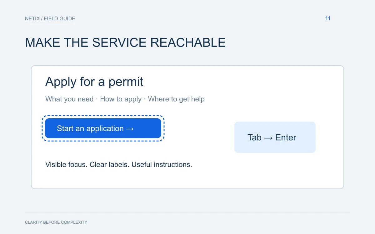
- Keyboard navigability so users who cannot operate a mouse can still move through forms and menus
- Alt text on images that allows screen readers to describe visual content meaningfully
- Captions on video content, including council meeting recordings and public announcements
- Plain-language writing that keeps reading levels accessible without talking down to anyone
- Mobile-first design, since a large share of lower-income residents access the internet primarily through smartphones
Running an automated accessibility scan is a reasonable starting point, but automated tools catch only a portion of real barriers. Manual testing — ideally with actual users who have disabilities — reveals what the software misses.
What Public Trust Actually Looks Like Online
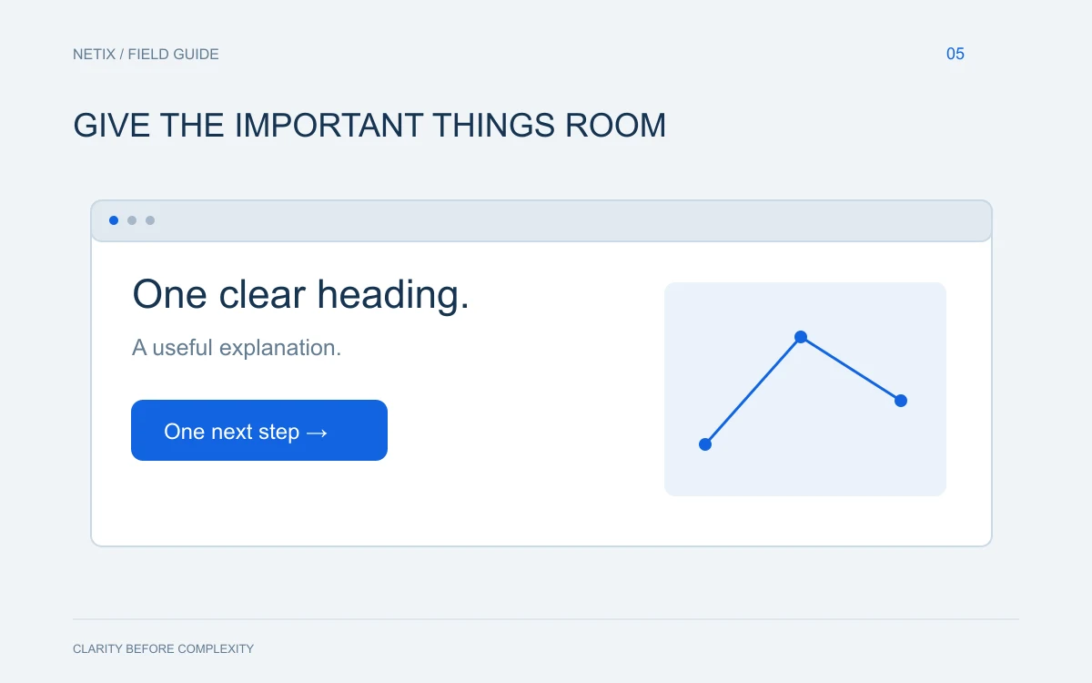
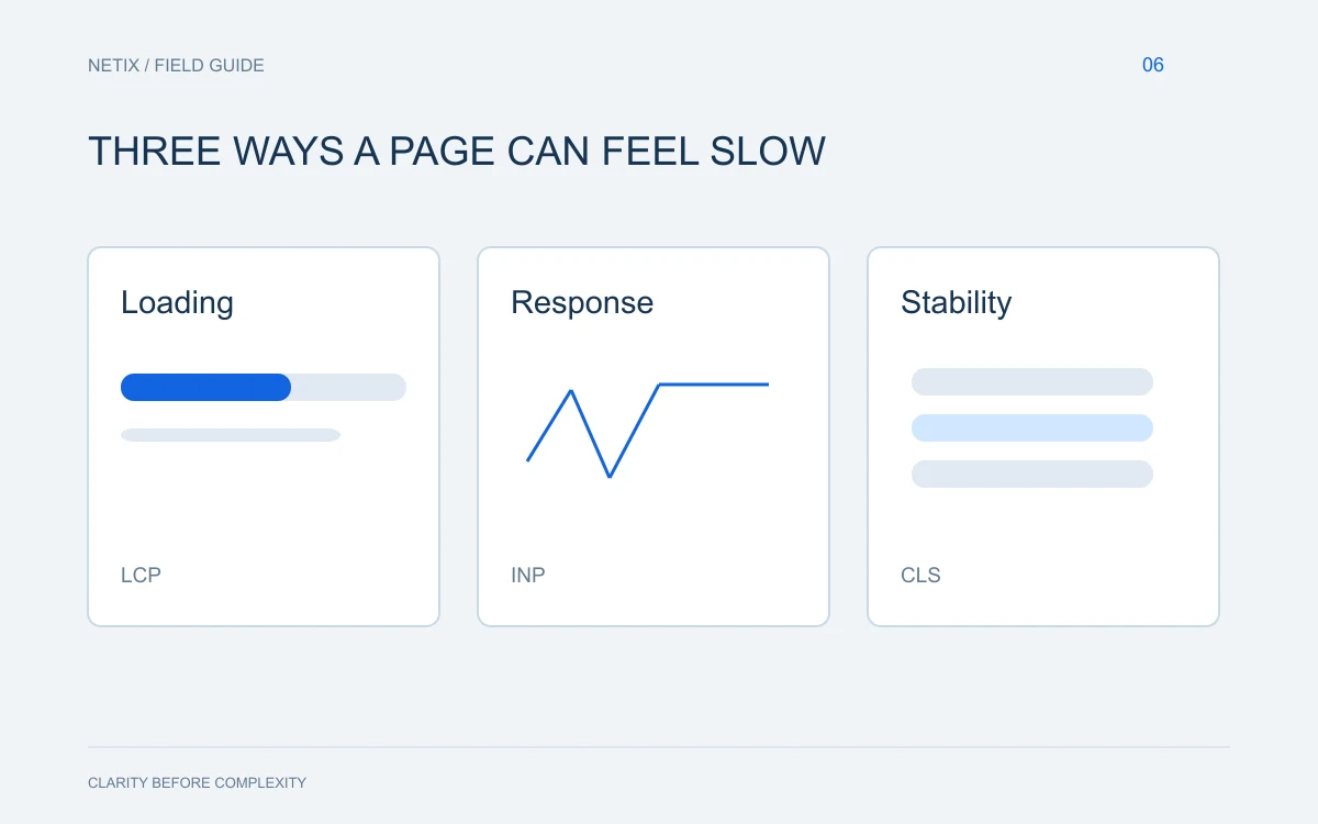
Trust is partly visual and partly functional. A government website that looks outdated signals neglect. One that loads slowly, breaks on mobile, or buries contact information sends an implicit message: we are not invested in serving you well.
Building trust online requires a few concrete commitments.
Consistency and Professionalism
The site should look like it belongs to a unified organization. Fonts, colors, and logos should be consistent across every page. When different departments have built their own microsites over the years with no shared design language, the result feels fragmented and unofficial — even if the content is accurate.
Transparent, Current Information
Nothing erodes trust faster than outdated information. A phone number that rings a disconnected line, office hours that don't reflect reality, or a form that references a program that ended — these details tell residents the site is not maintained and, by extension, that the organization behind it may not be attentive either.
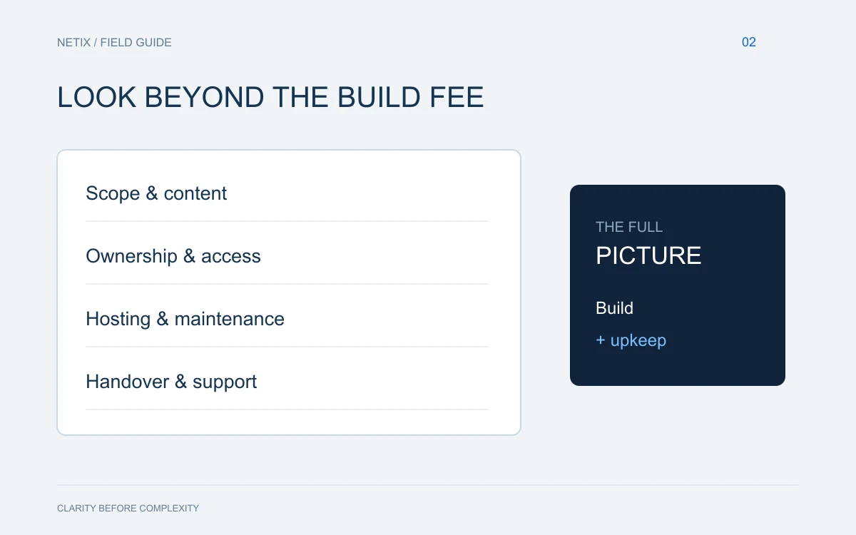
Establishing a clear content ownership model — where specific staff members are responsible for keeping specific pages current — is as important as any design decision.
Security Signals
Government sites should always run on HTTPS. Residents submitting personal information, paying fees, or applying for services need visible confirmation that the connection is secure. A missing padlock icon or a browser security warning will send people away immediately, and reasonably so.
Easy Pathways to Help
Not every resident will find what they need through navigation menus alone. A prominent search bar, clearly labeled contact pages, and even a live chat option for common questions all reduce friction. When someone does need to call or email, that path should be a single click away from anywhere on the site.
Common Mistakes Worth Avoiding
Many municipal sites share the same recurring problems. Being aware of them is the first step toward addressing them.
- PDF overload: Posting PDF documents instead of web pages creates barriers for screen readers and mobile users. Where possible, convert key information into native web content.
- Orphaned pages: Old event pages, expired notices, and defunct program pages accumulate over time and clutter search results. Regular audits keep the site clean and credible.
- Inaccessible forms: Online forms that require specific file formats, have no error recovery, or time out without warning create real hardship for residents trying to complete official processes.
- No feedback mechanism: Without a way for residents to report a broken link or a confusing page, problems go unnoticed indefinitely.
Starting a Realistic Improvement Plan
A full redesign is not always feasible on a government budget or timeline. But meaningful progress is possible in stages.
Begin with an honest audit. Walk through your site as a first-time visitor would. Try to complete five common tasks — paying a bill, finding a meeting agenda, submitting a service request — and document every point of friction.
Prioritize fixes that affect the most residents. A broken water bill payment form matters more than a color inconsistency on the tourism page.
Build accessibility into every future update rather than treating it as a separate remediation project. When a new page is added or a form is redesigned, accessibility review should be part of the standard process, not an afterthought.
Finally, invest in training for the staff who maintain content. The best-built website degrades quickly if the people updating it do not understand basic accessibility and content standards.
The bottom line: a government website is public infrastructure. It deserves the same care and maintenance as a road or a public building — because for many residents, it is the primary interface with local government.
Ready to Build Something the Community Can Rely On?
Netix Solutions works with organizations nationwide to design websites that are accessible, trustworthy, and built to last. If your municipal or government site is overdue for a serious review, we are glad to have that conversation.