Every year brings a fresh wave of web design trends, and it can feel like you need to overhaul your entire site just to keep up. But here's the honest truth: not every trend is worth your time or your budget. Some will genuinely help you connect with customers and grow your business. Others are little more than digital window dressing that can actually hurt your results.
At Netix Solutions, we work with small business owners across the country who want websites that work — not just websites that look impressive at a design awards ceremony. So let's break down what's worth adopting right now, and what you can safely leave behind.
Trends Worth Adopting
Simplified, Clean Navigation
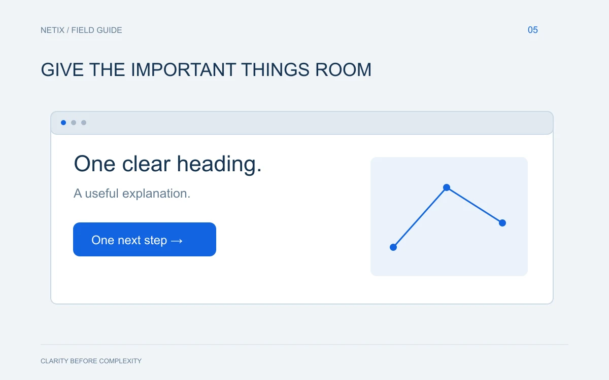
Visitors to your site decide very quickly whether they're in the right place. Clean, intuitive navigation — with a clear menu, a logical page hierarchy, and an obvious call-to-action — removes friction and guides people toward becoming customers. This isn't glamorous, but it's one of the highest-impact improvements you can make. If someone has to hunt for your phone number or services page, you're losing business.
Mobile-First Design (Still Matters More Than Ever)
The majority of web traffic now comes from mobile devices, and Google ranks your site based on its mobile experience. If your website still feels like a shrunken-down desktop version on a phone screen, that's a problem you need to fix now — not eventually. Mobile-first design means building the experience for smaller screens first and scaling up, not the other way around.
Accessibility Improvements
Designing for accessibility — sufficient color contrast, readable font sizes, keyboard-navigable menus, and descriptive image alt text — isn't just the right thing to do. It also helps your SEO, broadens your audience, and reduces legal risk. Small tweaks here can make a meaningful difference for a significant portion of your potential customers.
Local Visual Authenticity
Stock photos are tired, and visitors can spot them instantly. Businesses that use real photos of their team, their location, and their actual work tend to build trust faster. If you're a local business, showing your real face — literally — gives you a genuine edge over faceless competitors. Even smartphone photography, used thoughtfully, beats generic imagery.
Clear, Outcome-Focused Copy
This sits at the intersection of design and content: instead of leading with "Welcome to our website," lead with what you do and who you help. Pair this with a design that puts your key message front and center — above the fold, in a readable font, on a clean background — and you'll see better engagement almost immediately.
Trends to Skip (For Now)
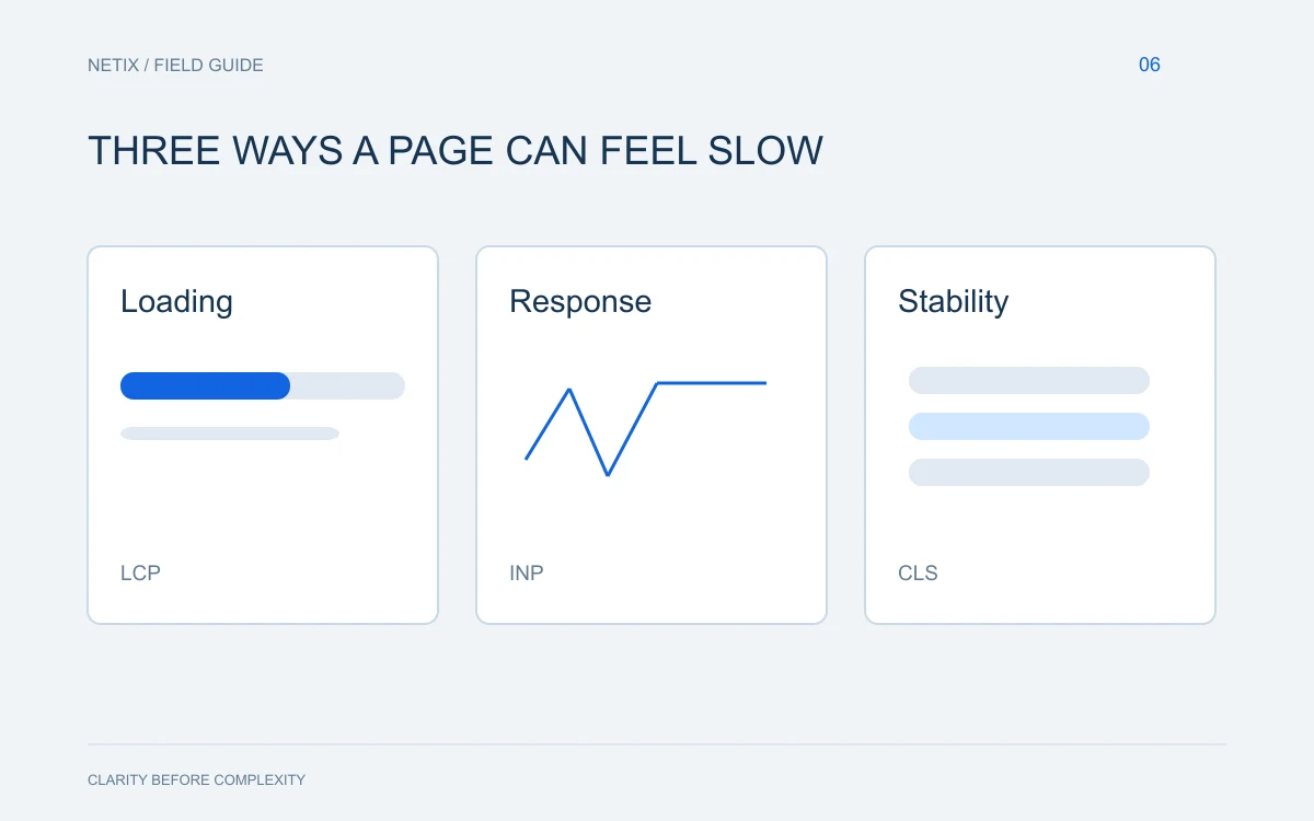
Heavy animations and parallax scrolling. These can look stunning on a design portfolio site, but they often slow your page load time significantly and can confuse or distract visitors who just want information. Speed and clarity beat visual drama every time for a small business site.
Dark mode as a default. Offering a dark mode toggle is fine, but designing your entire site around a dark color scheme can reduce readability and may not align with the approachable, trustworthy image most local businesses want to project.
AI-generated content dumped straight onto the page. AI tools can help you brainstorm and draft, but unedited AI copy tends to sound hollow and generic. Your customers want to feel like they're talking to a real person who understands their problem.
Overly complex homepages. Multiple full-screen sections, autoplay videos, chatbots, pop-ups, and live feeds all fighting for attention at once creates cognitive overload. Pick one goal for your homepage and design toward it.
Trendy fonts that sacrifice legibility. Stylized display typefaces can be fun, but if your visitors are squinting to read your headline on a phone screen, the font is working against you.
How to Decide What's Right for Your Site
The simplest filter is this: does this feature serve my customer, or does it serve my ego? A design decision that makes it easier for someone to find you, trust you, and contact you is worth making. A design decision that impresses other designers but adds three seconds to your load time is not.
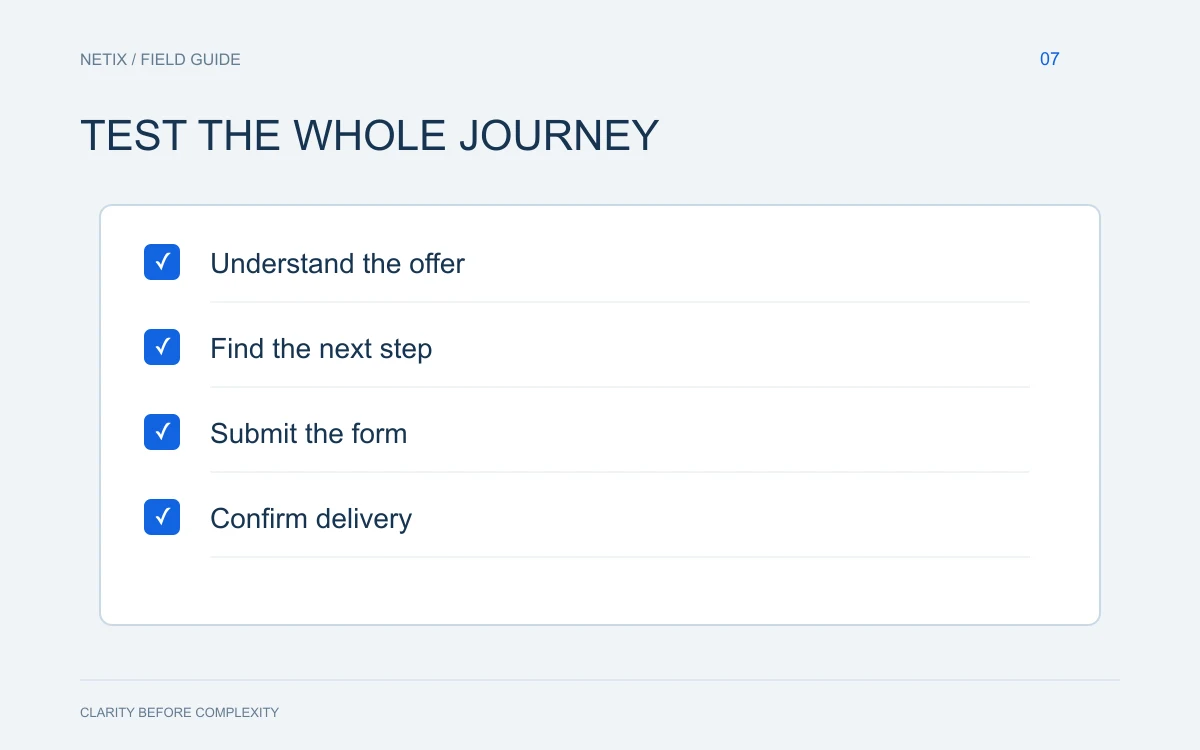
You also don't need to do everything at once. Start with the fundamentals — mobile performance, clear navigation, real photography, and honest copy — and layer in improvements from there.
Bold takeaway: The best website for your small business isn't the flashiest one. It's the one that loads fast, clearly explains what you do, and makes it effortless for the right customers to reach you.
If you're not sure where your site currently stands, the team at Netix Solutions would love to take a look. We help small businesses nationwide build websites that drive real results — no unnecessary complexity, no chasing trends for trend's sake. Reach out to us and let's talk about what your site could be doing better.