The Website You Set and Forgot
You built a website, crossed it off the list, and moved on. That's exactly what most small business owners do — and it's exactly why a lot of websites slowly become liabilities instead of assets.
The tricky part is that a struggling website rarely sends you a warning. Traffic keeps coming in, the site keeps loading, and on the surface everything looks fine. But visitors are leaving without calling, without buying, without filling out a single form.
If your site is doing any of the following seven things, it's costing you real business right now.
1. It Takes More Than a Few Seconds to Load
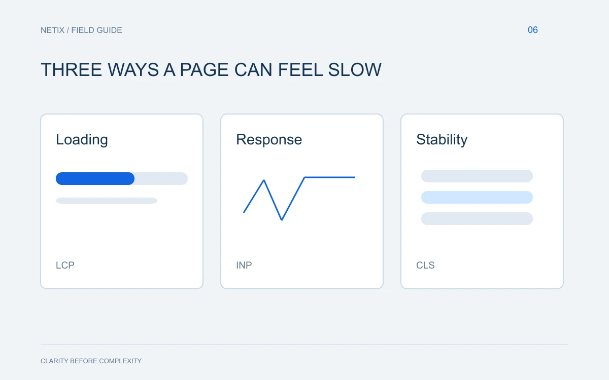
Visitors are impatient, and they have every reason to be — their time is short and their options are plentiful. If your pages take more than a few seconds to appear, a significant portion of your visitors will leave before they ever see what you offer.
Slow load times are often caused by oversized images, bloated code, or cheap hosting. None of these problems are obvious to the naked eye, but they are fixable. Use a free tool like Google PageSpeed Insights to get a baseline reading on where you stand.
2. It Looks Bad on a Phone
More than half of all web browsing happens on mobile devices. If your site requires pinching, zooming, or horizontal scrolling to read on a smartphone, you are actively pushing away a large portion of your audience.
A mobile-unfriendly site also hurts your ranking in search results. Google prioritizes mobile experience when deciding how to rank pages, so a poor mobile design can make you invisible before a visitor even has the chance to be frustrated.
Pull out your phone right now and browse your own site as a stranger would. What you find may surprise you.
3. No One Knows What to Do Next
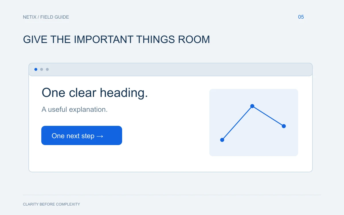
Every page on your website should guide a visitor toward a clear next step — whether that's calling your office, requesting a quote, or signing up for something. This is called a call to action, and when it's missing or buried, visitors simply leave.
Weak calls to action sound like:
- "Feel free to contact us at your convenience."
- "Learn more" with no context about what they're learning.
- A phone number tucked in tiny text at the bottom of the page.
Strong calls to action are specific, visible, and tell the visitor exactly what they'll get. "Get a Free Estimate" is more compelling than "Contact Us" because it answers the question: what's in it for me?
4. The Content Reads Like It Was Written for Search Engines, Not People
Keyword stuffing was a common practice years ago. Some older sites are still full of awkward, repetitive phrases that were designed to game search algorithms rather than actually communicate with human beings.
This kind of copy erodes trust fast. When a visitor reads something that sounds robotic or nonsensical, they question whether you're a legitimate business. Well-written, clear, conversational content not only keeps people reading — it also performs better in search today, because search engines have gotten very good at recognizing natural language.
5. Your Contact Information Is Hard to Find
This one seems obvious, and yet it's one of the most common problems on small business websites. If a visitor has to dig through multiple pages to find a phone number or address, many of them simply won't bother.
Your phone number should appear in the header of every page. Your address, hours, and a contact form should live on a dedicated page that's no more than one click away from anywhere on your site. Make it effortless for people to reach you — that's the whole point.
6. The Design Looks Dated
First impressions happen fast. When someone lands on your website, they make a judgment about your business almost immediately, and that judgment is heavily influenced by how the site looks.
A dated design — cluttered layouts, old fonts, stock photos from a decade ago, colors that clash — signals that your business may not be keeping up with the times. Whether or not that's true, perception shapes decisions. A clean, professional design communicates that you take your business seriously and that you'll probably take your customers seriously too.
7. You Have No Idea How It's Performing
If you don't have analytics set up on your website, you are flying blind. You have no way of knowing which pages people visit most, where they drop off, how they found you, or whether any of your marketing efforts are actually working.
Free tools like Google Analytics and Google Search Console give you this information without costing a cent. Once you can see the data, you can make smart decisions instead of guesses.
What to Do With This Information
Go through this list one item at a time. For each problem you identify, write it down and note whether it's something you can fix yourself or something that requires professional help.
Some of these issues — adding analytics, updating your contact page, rewriting a call to action — are things many business owners can handle on their own with a little time. Others, like a full mobile redesign or a site speed overhaul, are better handled by someone who does this every day.
The bottom line: a website that isn't actively working for your business is quietly working against it. Small fixes compound over time into real revenue, and the cost of inaction is usually higher than the cost of improvement.
If you're not sure where to start, or if you'd rather have a professional take a look, the team at Netix Solutions is happy to do a straightforward website review. We work with small businesses and organizations across the United States, and we'll give you honest feedback with no pressure attached. Reach out whenever you're ready.