The Visitor You Are Probably Ignoring
Picture a potential customer searching for your business on a lunch break. They are standing in a parking lot, phone in hand, squinting at a website that loads slowly, displays tiny text, and requires pinching and zooming just to read your phone number. They leave. You never knew they were there.
This scenario plays out across small-business websites every day. The majority of web traffic now arrives through mobile devices, yet many businesses still treat desktop as the default and mobile as an afterthought. Mobile-first design flips that assumption — and doing so can meaningfully change how many visitors stay, engage, and eventually contact you.
What Mobile-First Design Actually Means
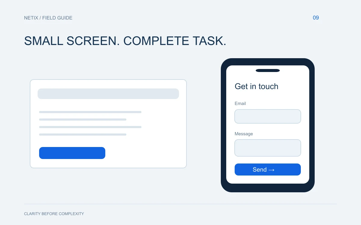
Mobile-first is a design philosophy, not just a technical checkbox. It means you plan, design, and build your website starting from the smallest screen and then scale up to tablets and desktops, rather than the other way around.
The traditional approach was to design a full desktop layout and then squeeze it down for phones. That process almost always produces compromises: menus that collapse awkwardly, images that overlap text, buttons too small to tap comfortably. Starting from mobile forces you to make hard decisions about what truly matters — your core message, your call to action, your contact information — and then give those elements the space and clarity they deserve.
A site built mobile-first is not a stripped-down version of your real site. It is your real site, designed so that every visitor gets a clean, fast, and intuitive experience regardless of what device they are holding.
Why Google Cares About This Too
Search engines index the mobile version of your website first. That means if your mobile experience is slow, hard to navigate, or missing content that appears on your desktop version, your search rankings can suffer — even for people searching on a desktop computer.
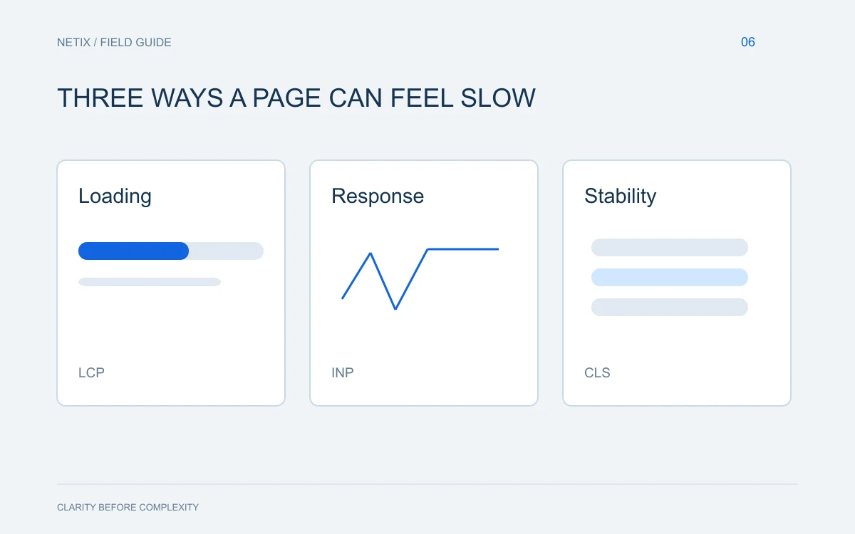
Page speed is a significant factor here. A site that takes several seconds to load on a phone will lose visitors before they ever read a single word, and search engines factor that behavior into how they rank pages. Compressing images, minimizing unnecessary code, and choosing a reliable hosting environment all contribute to faster load times on mobile devices.
The bottom line: a poor mobile experience does not just hurt your phone visitors — it can drag down your visibility for everyone.
Practical Ways to Serve Your Mobile Visitors Better
You do not need a complete redesign to start improving the mobile experience on your site. Some of the most impactful changes are straightforward.
Make Your Contact Information Effortless
Your phone number should be tappable. When a mobile visitor taps a phone number formatted as a link, their device opens the dialer automatically. That one small detail removes friction at the exact moment someone is ready to call you. The same logic applies to your address — linking it to a maps application makes it easy to get directions in one tap.
Simplify Your Navigation
Desktop menus with multiple dropdowns and dozens of links become a problem on small screens. Pare your navigation down to the pages that matter most: your services, your about page, and a clear path to contact you. A simple hamburger menu — the three-line icon — works well for mobile as long as it opens cleanly and the links inside are large enough to tap without frustration.
Use Readable Text Without Zooming
Text that requires zooming to read is a fast way to lose visitors. A body text size of at least 16 pixels is a widely accepted baseline for comfortable mobile reading. Equally important is line spacing and contrast — light gray text on a white background may look refined on a large desktop monitor but becomes genuinely hard to read on a phone in sunlight.
Optimize Your Images
High-resolution images that look stunning on a large screen can become the biggest drag on your mobile load time. Images should be compressed and sized appropriately for the screen displaying them. Modern image formats and lazy loading — where images load only as a visitor scrolls toward them — can dramatically reduce how long someone waits before your page feels usable.
Design Buttons for Fingers, Not Mouse Pointers
A small link that is easy to click with a cursor becomes a frustrating target for a finger. Buttons and tappable elements should be large enough that a visitor does not have to aim carefully. If two tappable elements are placed too close together, accidental taps on the wrong one erode trust quickly.
Test on Real Devices
Browser tools that simulate mobile screens are useful, but they are not a replacement for actually holding a phone and using your site. Ask someone unfamiliar with your business to find a specific piece of information using their own device. Watch where they hesitate or struggle. Those moments are your clearest design instructions.
What to Prioritize If You Are Starting Fresh
If you are building a new site or undertaking a significant redesign, these are the principles worth anchoring everything to:
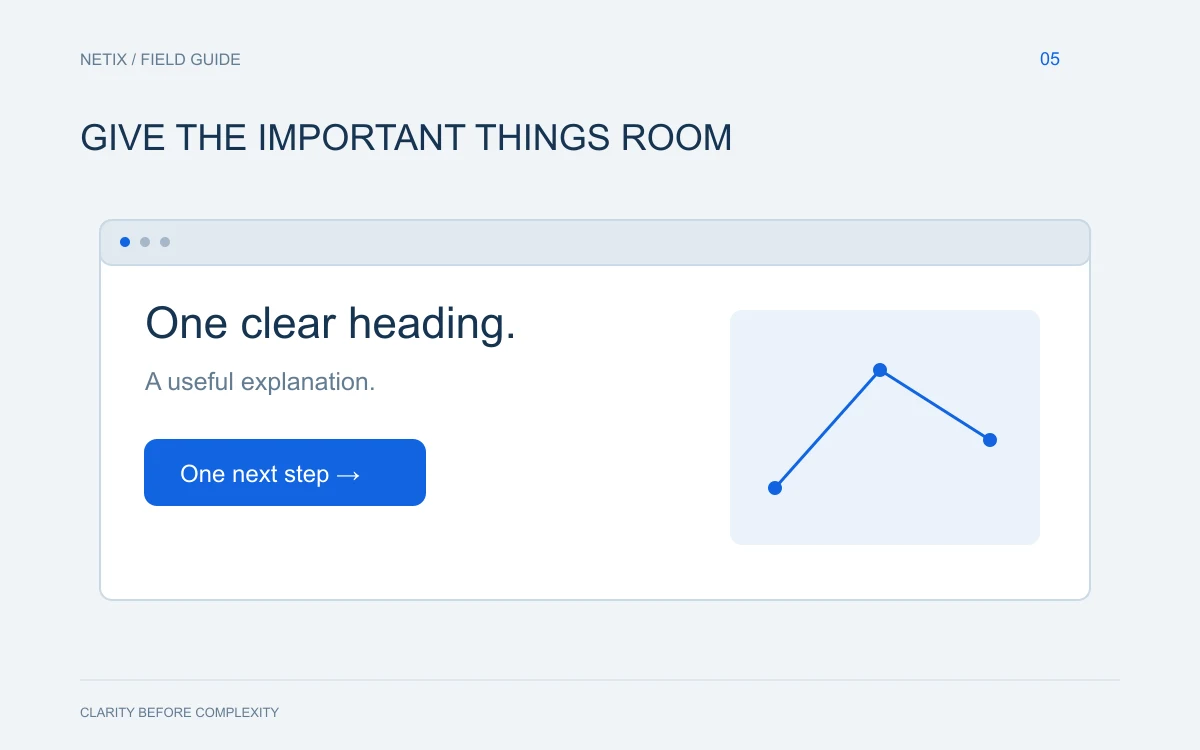
- Lead with your most important message above the fold on a phone screen
- Keep forms short — ask only for what you genuinely need
- Make your primary call to action visible without scrolling
- Choose a font that remains legible at small sizes
- Test load speed regularly and treat slowdowns as urgent fixes
The Bigger Picture for Small Businesses
For a small business, your website is often the first impression a potential customer gets. When that impression happens on a phone — which it increasingly does — the experience either builds confidence or quietly sends that visitor somewhere else.
Mobile-first design is not a trend that will fade. It is the current reality of how people find and evaluate businesses, and it rewards those who take it seriously with more engaged visitors, lower bounce rates, and more inquiries.
If you are unsure how your current site holds up on mobile, or if you are planning a new site and want to get it right from the start, the team at Netix Solutions is glad to take a look and talk through your options. A conversation costs nothing, and you will leave with a clearer picture of where you stand.